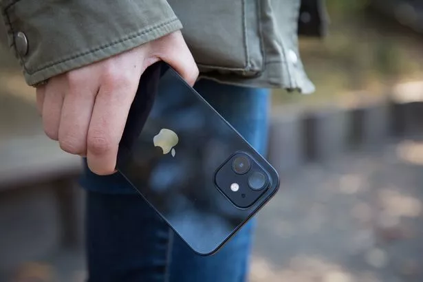
Uncover the hidden meanings behind the iPhone logo. A bitten apple that tells a story of history and meaning of the iPhone logo, simplicity and sophistication.

Few logos in the world are as instantly recognizable and universally iconic as the Apple logo. That simple, bitten fruit has become synonymous with cutting-edge technology, sleek design, and a brand experience unlike any other. But the iPhone logo, as we know it today, is the result of a fascinating journey, marked by evolution, controversy, and ultimately, a triumph of minimalist brilliance.
The Birth of an Icon:
The iPhone’s logo wasn’t born with its signature bite. The journey of the iPhone logo begins with the inception of Apple itself. Co-founded by Steve Jobs, Steve Wozniak, and Ronald Wayne in 1976, the trio aimed to revolutionize the personal computing industry. The first Apple logo, designed by Wayne, featured Sir Isaac Newton sitting beneath an apple tree. However, this intricate design was short-lived, and in 1977, Rob Janoff was commissioned to create a simpler and more versatile logo.

Janoff’s initial sketches were radical. He stripped away the rainbow and the scene, leaving just a simple, single-color apple. But something was still missing. Legend has it that Janoff took a bite out of an apple to understand its shape better, and voila! The now-iconic bite was born.
You may also read: Apple Pay in India – Price, Features, Launch Date – All You Need to Know
The Genesis of the iPhone Logo
The iPhone logo made its debut in 2007 when Apple unveiled its revolutionary smartphone to the world. The initial design featured a simple and stylish representation of the device itself, complete with a rounded top, a circular home button, and a slightly curved bottom. This early rendition set the tone for the logo’s future iterations, emphasizing simplicity and elegance.
Evolution of the Logo
Over the years, the iPhone logo has undergone subtle yet significant transformations. Apple’s commitment to innovation is not only evident in its products but also in the way it presents them to the world. The changes in the logo reflect the evolution of the iPhone itself, adapting to the shifting trends in design while maintaining a timeless quality.
2007 – 2012: The Classic Apple Image
The first iPhone logo featured a black silhouette of the device with the iconic Apple bitten logo on the top. The simplicity of this design conveyed a sense of modernity and sophistication, aligning perfectly with the iPhone’s groundbreaking technology.
2013 – 2016: The Flatter Approach
In the era of flat design, Apple revamped its visual language, and the iPhone logo followed suit. The 2013 version featured a flatter, more streamlined representation of the iPhone, eliminating some of the details present in the earlier design. The bitten Apple logo remained, underscoring the brand’s identity.
2017 – Present: The Removal of Text
In the most recent iteration, Apple took a bold step by removing the text “iPhone” from the logo entirely. The design now consists solely of the bitten Apple logo, allowing the symbol to stand on its own. This move reflects Apple’s confidence in the global recognition of the iPhone brand and reinforces the idea that the symbol speaks for itself.

Design Elements and Symbolism
The Bitten Apple: A Bite of Knowledge
The bitten apple in the logo is one of the most iconic and enduring symbols in the tech industry. Its origins date back to Apple’s early days when co-founder Steve Jobs wanted to ensure that the logo wouldn’t be confused with a cherry or any other fruit. The bite, positioned on the right side of the apple, also serves as a play on words, symbolizing a “byte” of information, a clever nod to the company’s technological prowess.
Simplicity: Less is More
The minimalist design of the iPhone logo is a testament to Apple’s design philosophy that simplicity is the ultimate sophistication. The absence of unnecessary details allows the logo to be easily recognizable, scalable, and adaptable across various mediums. This simplicity also echoes the clean and intuitive design of Apple products, reflecting a user-centric approach.
The Monochromatic Palette: Timeless Elegance
The choice of a monochromatic color palette for the iPhone logo, typically black or white, contributes to its timeless elegance. This design decision aligns with Apple’s overall branding strategy, emphasizing a sense of luxury and exclusivity. The monochrome color scheme also enhances the logo’s versatility, ensuring it remains visually striking in any context.
Beyond the Surface: Symbolism and Perception
The iPhone logo’s power lies not just in its simplicity and elegance, but also in the multitude of meanings it evokes. The bite, as Janoff intended, suggests knowledge, curiosity, and a willingness to explore. It also hints at rebellion and nonconformity, qualities Apple has long cultivated in its brand image. The sleek, rounded form of the apple conveys approachability and user-friendliness, while the solid color palette exudes sophistication and premium quality.
Furthermore, the iPhone logo transcends cultural and linguistic barriers. The apple is a universally recognized symbol, instantly understood across demographics and geographies. This makes the logo a powerful marketing tool, effectively communicating Apple’s brand values and aspirations to a global audience.
Facing the Bite of Controversy
Despite its widespread acclaim, the iPhone logo has not been without its share of controversy. In 2012, a German artist, Karl-Heinz Weinzierl, sued Apple, claiming the iPhone logo infringed upon his own bitten apple logo, used for his Rote Ritter apple juice brand. While the lawsuit was ultimately dismissed, it highlighted the potential pitfalls of minimalist design, where inspiration can blur into imitation.
Another point of contention has been the iPhone logo’s perceived lack of evolution. Unlike other tech logos that morph and adapt over time, the iPhone logo has remained remarkably consistent. Some argue this stasis indicates a lack of innovation, while others see it as a testament to the logo’s timeless design and enduring power.
However, the bite has also attracted controversy. Religious groups have interpreted it as a symbol of temptation and sin, while conspiracy theorists have seen hidden meanings and Illuminati connections in its design.
Despite the interpretations, one thing remains clear: the bitten apple is a potent symbol that has transcended its tech origins to become a cultural icon. It represents not just a device, but a way of life, a philosophy of simplicity and innovation that continues to captivate and inspire millions.

Impact of iPhone Logo on People
The iPhone logo, that little bitten apple we see on our phones, has more influence on our social lives than we might realize. Here’s a look at how this tiny symbol affects the way we connect and interact with each other.
- Status Symbol:
Seeing someone with an iPhone, marked by the familiar logo, often carries a certain status. It’s not just a phone; it’s a statement. People may perceive individuals with iPhones as tech-savvy or trend-conscious, impacting the way we are perceived in social circles. - Social Connection:
The iPhone logo is not just on our phones; it’s on our messaging apps, social media, and more. It has become a symbol of our constant connection to the digital world. Sharing photos, updates, and messages through this device and its logo has become a fundamental part of our social interactions. - Brand Identity:
The iPhone logo is more than just a symbol; it represents the Apple brand. People often identify strongly with brands, and having an iPhone can become a part of one’s identity. This shared brand identity can create a sense of belonging among iPhone users. - Cultural Influence:
The iPhone and its logo have become cultural icons. Owning an iPhone is not just about having a phone; it’s about being a part of a cultural phenomenon. The logo, in this context, becomes a symbol of shared experiences, trends, and lifestyle choices. - Social Media Aesthetics:
With the rise of social media platforms, the iPhone logo often appears in photos and selfies. People proudly showcase their iPhones and the logo, contributing to a visual aesthetic on social media that revolves around the sleek and recognizable design of Apple products. - Communication Style:
The iPhone logo influences the way we communicate. iMessage, FaceTime, and other Apple-specific features have become integral to how we stay in touch. The logo is a constant reminder of the tools we use for communication, shaping our preferences and habits. - Community and Fandom:
The iPhone logo has fostered a sense of community among Apple users. There’s a shared enthusiasm and loyalty among iPhone owners, often leading to discussions, forums, and communities dedicated to Apple products. This sense of belonging can extend our social circles into the digital realm.
Looking Ahead: Future of iPhone logo

Predicting the future of design elements, especially iconic ones like the iPhone logo, involves a degree of speculation. However, we can explore potential directions based on current trends, technological advancements, and Apple’s design philosophy.
- Minimalist Evolution:
Apple has always been known for its minimalist design approach. The future of the iPhone logo might involve subtle refinements while maintaining its simplicity. - Dynamic and Interactive Elements:
The iPhone logo might become more fun and responsive in the future. As technology gets better, the logo could do things like move, change colors, or adjust its design based on what users do. - Augmented Reality Integration:
As technology advances, Apple might explore incorporating augmented reality (AR) elements into the iPhone logo. - Personalization Features:
In the future, the iPhone logo could let people make their phones more personal. This might mean you can choose your favorite colors or themes for the logo, making your device feel unique and just the way you like it. - Incorporation of Sustainable Design:
Apple might start caring more about the environment. They could make their logo show that they care about nature. - Collaborations and Limited Editions:
Apple might team up with artists, designers, or other companies to make special versions of the iPhone logo. - Gesture or Biometric Integration:
With the increasing focus on user experience and convenience, Apple might explore integrating gestures or biometric elements into the logo.

Conclusion
The iPhone logo is more than a graphical element; it is a linchpin of Apple’s brand value. Its ability to convey trust, innovation, and emotional connection has made it an indispensable asset in the competitive tech industry. As Apple continues to evolve and innovate, the iPhone logo will likely remain a beacon, guiding consumers towards a brand that values excellence and consistently delivers on its promises. In the ever-changing landscape of technology, the iPhone logo stands as a timeless symbol of Apple’s enduring brand value.

Hi I am Harish. I am a blogger, writer. I am also a photographer. I love to share my thoughts and experiences through the words in my blog. Thank you.


